COCHA Corporate

2025 
UI mobile & desktop, Figma
Project overview
How can we refresh COCHA Corporate’s website to reflect updated content and a renewed brand identity?

The corporate website needed a makeover due to the addition of new content and visual guidelines. The goal was to modernize its appearance and ensure consistency between desktop and mobile versions.
Role
Position: UI Designer  
Duration: 3 months 
Team: Corporate Travel and Marketing , alongside front-end developers.  
Scope: Visual design of desktop and mobile interfaces.  
Design process
1.- Conducted a visual analysis of the existing site to identify branding inconsistencies.

2.- Created mood boards and visual references to propose an updated look and feel.

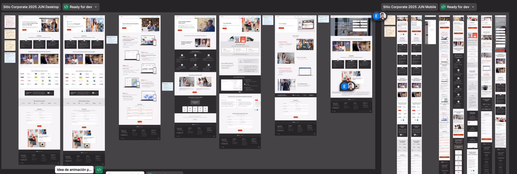
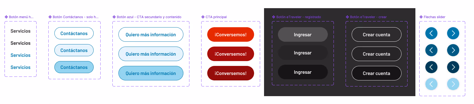
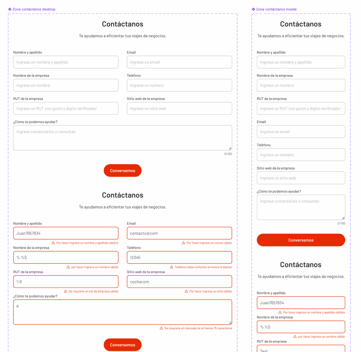
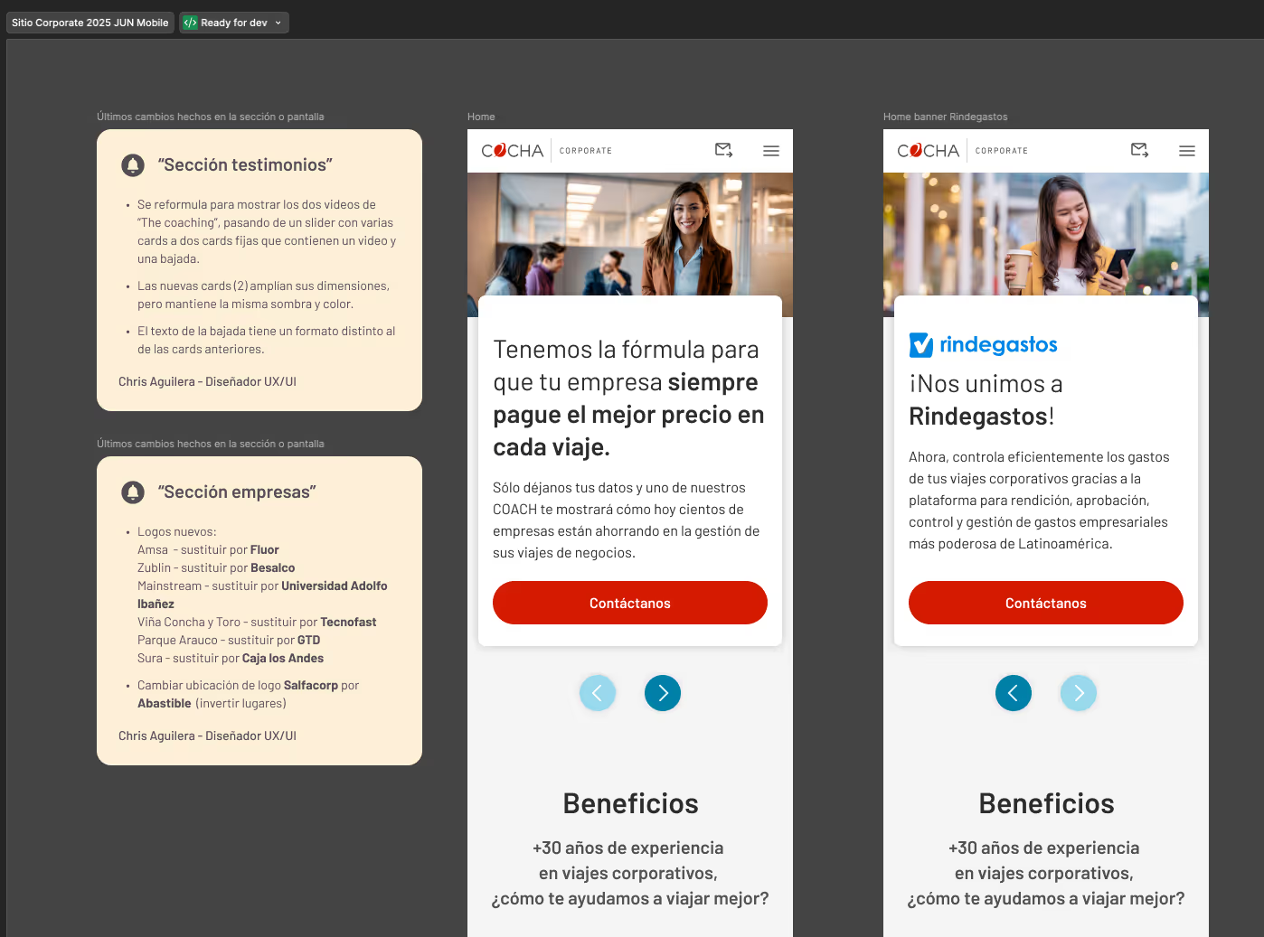
3.- Designed desktop and mobile mockups in Figma, focusing on: 
Clear hierarchy of headings and sections.
Typography and colors aligned with the visual identity.         
Reusable components to facilitate implementation.

4.- Handoff to the development team included detailed visual specifications.
Challenge
The pre-existing website presented multiple friction points, ranging from visual inconsistencies that clashed with the company’s brand image to a content structure that lacked the necessary clarity for B2B clients.

These aesthetic and organizational issues were compounded by a mobile interface that failed to adhere to responsive design best practices.

Operationally, the absence of a CRM or digital tracking system forced the team to manage contacts manually and store data locally, resulting in a critical lack of baseline metrics to evaluate the site's previous performance.
Learnings
Strengthened my experience in UI visual design and adaptation to existing brand systems. 

Confirmed the importance of providing clear specifications to the development team to ensure consistency in implementation.

Although the project did not include research or testing, it was a valuable exercise in applying visual design to a real-world corporate context.

This project confirmed the importance of incorporating metrics and testing early; now, with digital tools in place, future UI/UX initiatives will be grounded in measurable data.
Result
 • A modern, brand-aligned corporate website.
 
• Enhanced visual consistency between desktop and mobile versions.

• A clear structure to effectively showcase corporate content and B2B value propositions.
• One key outcome was that the organization adopted a CRM, enabling digital tracking of content and laying the groundwork for measuring outcomes in future design iterations.